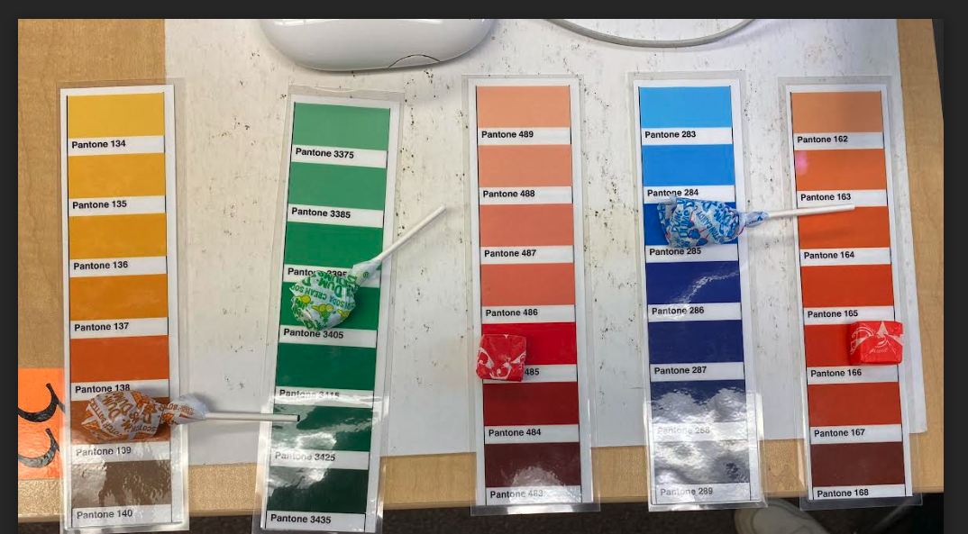
 1. It was easy/hard to decipher the colors, and why?
It was easy to decipher all of them except for the orange which we couldn't find a perfect match for 2. How does the Pantone system improve design and printing? It allows for precision in what color you need. 3. When would be a good time to use Pantone colors in this class? When you're trying to mimick a specific color. 4. Names: Emma Z., David J., Mihir A., Marvin Y., Ahmad F., Yusuf C.
0 Comments
Original P5 logo and the text at the bottom is white, the added "R" for Royal is made of various shades of brown or gold. The only colored section, the "R" for Royal has a monochromatic color scheme. Yellow, black, green, red, and white. The color scheme seems most similar to a triadic scheme, but due to it being an older logo, the designers might have mainly just intended to use the Italian flag colors at the top rather than a specific color scheme.

 It was difficult to use the obstruction because I wasn't very familiar with Harry Potter beforehand, but I was successful by looking into what special objects exist in Harry Potter then using the Golden Snitch as an inspiration and I could have done better overall by adding more detail like putting the patterns found on the actual Golden Snitch onto my emoji of it.
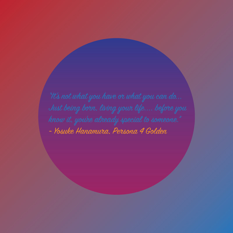 1. Why did you choose this quote or saying and what significance does it hold to you?
I chose this quote because it was the first one that came to my mind when thinking of which quote to use. The significance it has to me is that Persona 4 Golden is one of my favorite games that I've played in the last few years, and I can relate to this quote in terms of the part about how what you have or what you can do isn't what's most important. 2. What do you like about your graphic? I like the way of the colors work together 3. What would you change? I would try to make something nicer to put as the artwork instead of a gradient |
AuthorWrite something about yourself. No need to be fancy, just an overview. Archives
September 2023
Categories |


 RSS Feed
